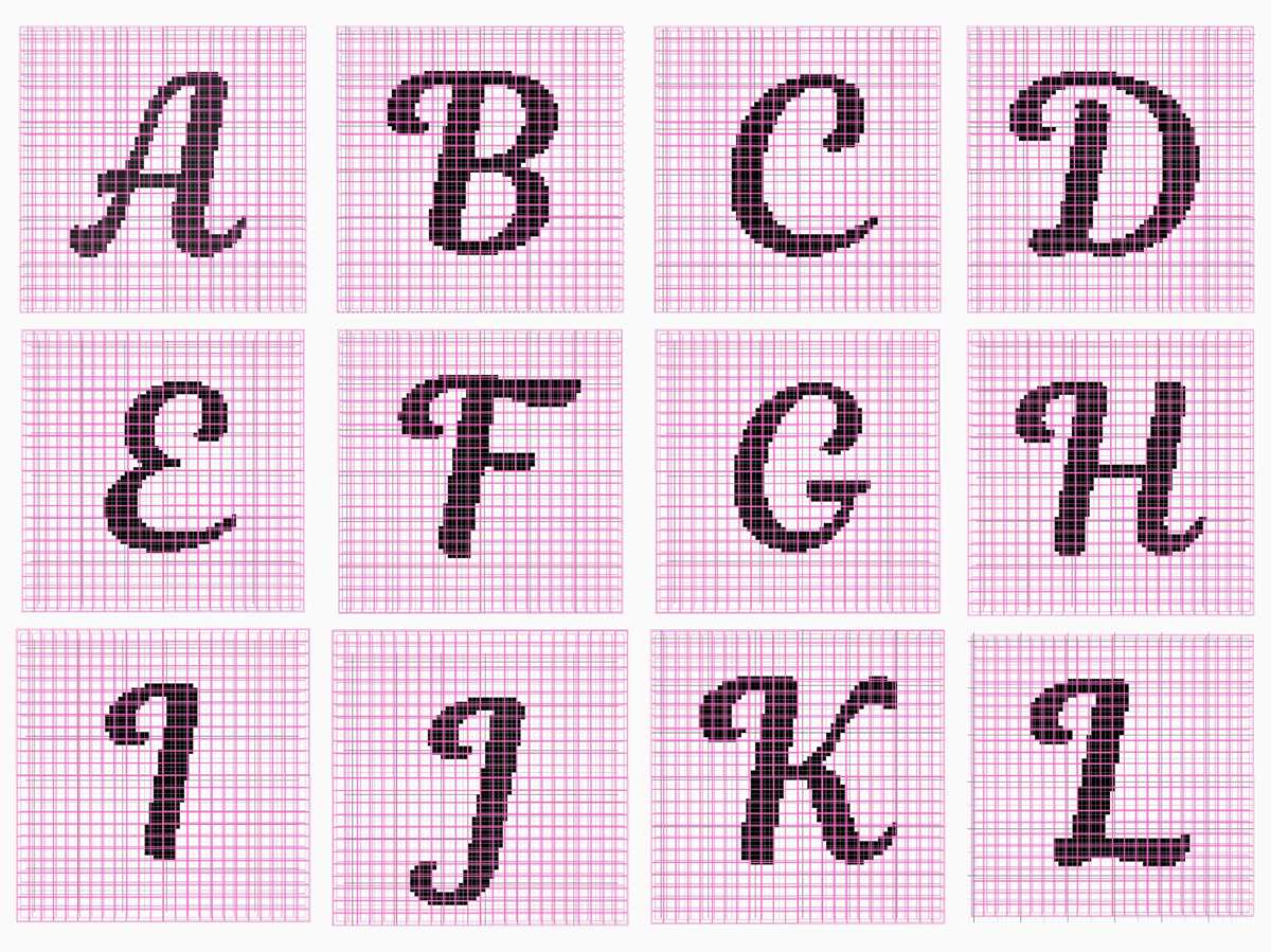
Choose a clear square-based alphabet template sized at 10×10 or 20×20 cells per character; this scale gives crisp edges and keeps stitch counts predictable. For most medium-weight yarn (category 4) and a 5 mm hook, each cell typically equals one stitch and one row, producing characters about 5–7 cm high. This proportion works well for blankets, name panels, and decorative inserts without distorting the shapes.
When preparing your pattern sheet, prefer high-contrast grid layouts with bold outlines around filled squares. Thin or faint grids often lead to counting mistakes, especially in curved characters like S, G, or R. A margin of at least 3 empty cells around each symbol prevents crowding and makes multi-line text easier to align. If you plan to combine colors, mark the background squares lightly to distinguish them from the active motif.
For consistent results, match the template density to your stitch gauge before you begin. Work a small swatch of at least 20 stitches by 20 rows, measure it, and compare the physical size to the chart scale. If the fabric looks compressed vertically, adjust by switching to extended stitches or by choosing a taller grid ratio such as 10×12. Careful calibration at this stage reduces rework and keeps wording sharp and readable on the finished piece.
Printable Crochet Letters Graph: Step-by-Step Usage Guide
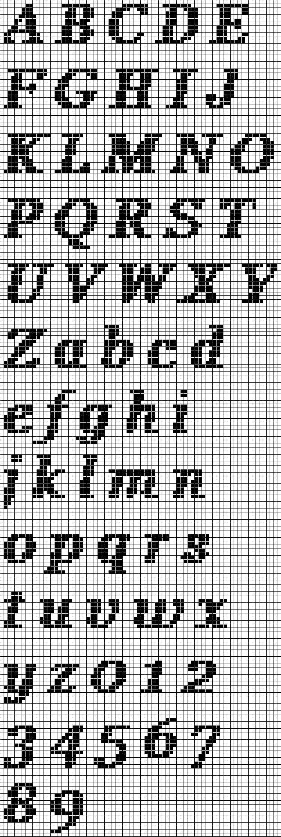
Download the alphabet stitch chart at the exact scale you plan to use so each square corresponds to one stitch; mismatched sizing leads to distorted text.
Open the pattern sheet and check the grid density first. If one cell equals a single stitch, count the number of squares across the chosen character and compare it with your swatch width. For example, if a motif spans 18 cells and your gauge is 4 stitches per inch, the finished width will be about 4.5 inches. Mark the first row on the template with a highlighter or digital annotation tool to avoid losing your place mid-row. Work row by row, reading right to left on odd rows and left to right on even rows when using single-stitch techniques. Keep a row counter nearby; skipping even one line will shift the entire word and force you to unravel several rows.
Use color contrast strategically. Dark yarn on a pale background produces sharper character edges, while low contrast softens the appearance but hides minor counting errors.
After completing the stitched text, block the fabric to even out the squares and clarify the shapes. Measure the finished panel again; small fibers like cotton often shrink slightly after washing, while acrylic tends to relax and expand. If the edges curl, add a simple border of 2–3 rounds of single stitches around the piece. Store the marked template with your project notes so you can reproduce the same wording and spacing in future designs without recounting from scratch.
How to Read and Interpret a Printable Crochet Letter Graph Correctly
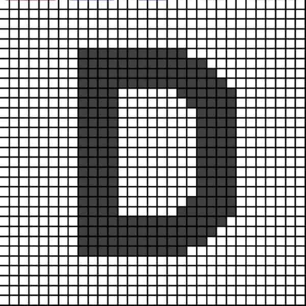
Match the grid orientation on the pattern sheet with your working direction before making the first stitch; most alphabet charts are read from the bottom row upward, and reversing this order will flip the design vertically.
Count the number of squares across and compare it with your stitch count in the foundation row. If the chart shows 28 cells but your base has 26 stitches, the motif will compress and distort. Adjust by adding or subtracting stitches before proceeding, rather than trying to compensate mid-project.
Pay attention to the color legend. Each symbol or shaded box represents a specific yarn shade, and confusion here produces unreadable text shapes. Highlight each color in the key with the same highlighter you plan to follow on the chart; this reduces mistakes during long rows where symbols repeat densely.
Track row progress with a removable marker or a magnetic ruler placed directly under the active line. Visual drift often causes skipped squares, especially in block-style alphabets where many adjacent cells share the same shade. Moving the guide after every completed row keeps alignment accurate.
Check whether the diagram assumes right-side-only work or alternating rows. Some lettering charts are designed for tapestry technique worked in rows, meaning every second row must be read from right to left. If the instructions mention “RS” and “WS,” flip your reading direction on the wrong side rows to keep characters facing correctly.
Measure your stitch gauge using the same yarn and hook planned for the project. A difference of just 0.5 mm in hook size can stretch a single character by several millimeters across multiple squares. Work a small swatch–at least 20 by 20 stitches–and compare its width and height to the grid proportions before committing to the full piece.
When shaping curved alphabet forms, avoid interpreting diagonal steps as smooth lines. Each square equals one full stitch, so curves will appear stepped by design. If a softer contour is desired, switch to a technique that supports half-stitch color changes or add surface embroidery after completing the base fabric.
Review the finished motif against the chart after completing each character, not only at the end. Early comparison makes it easier to catch a misplaced square, and correcting one row immediately saves extensive unraveling later.